Identify the neutrals already present
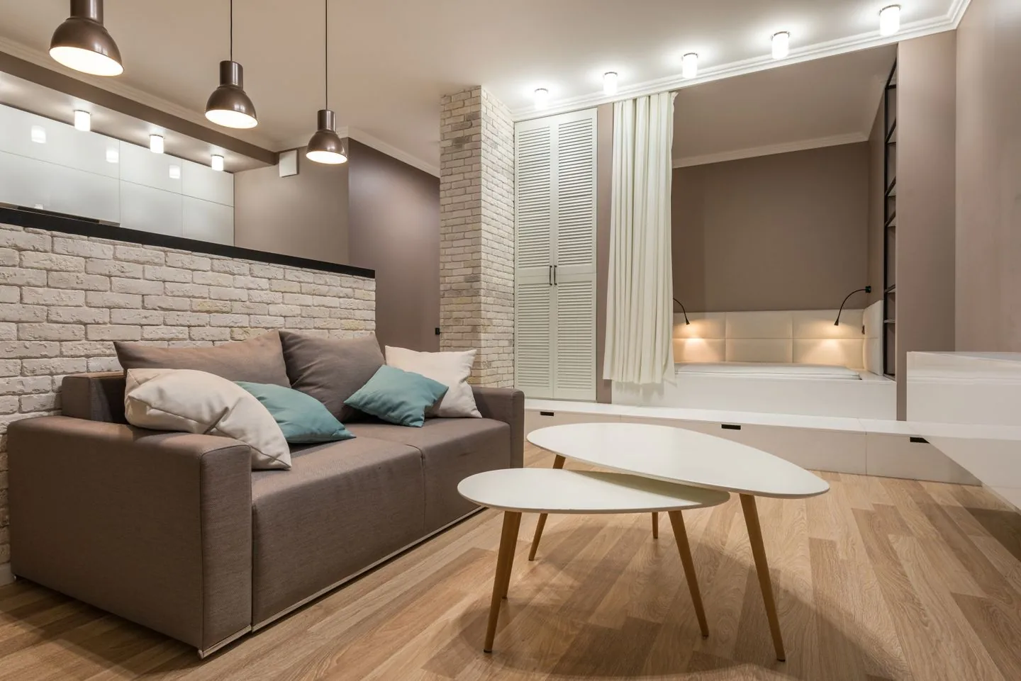
Neutral rooms are rarely colourless. Floors, upholstery and walls may contain yellow, pink, green or grey undertones. Look at these large surfaces before choosing an accent. A colour that feels lively beside warm timber may look quite different against a cool grey sofa.
Bring a fabric sample, print or paint card into the room and move it between the important surfaces. Check daylight and evening light. The aim is not to find a scientifically perfect match, but to avoid choosing an accent in isolation and then wondering why it feels disconnected once it arrives.
Choose a colour with a personal reason
Start with something you enjoy looking at: a painting, a fabric or a colour in a favourite object. This gives the decision more staying power than selecting whichever shade currently appears everywhere. Think about whether you want the room to feel livelier, softer or more intimate.
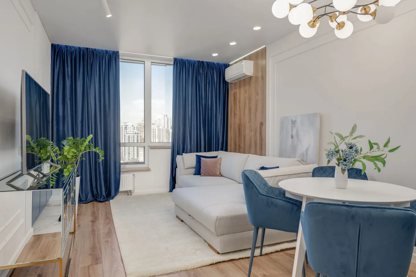
You can use a muted version of a colour rather than a fully saturated one. A dusty blue or softened green may provide enough change in a quiet space. Conversely, one clear bright note can feel confident if the surroundings remain restrained. Test the amount as well as the hue.
Begin with a moveable element
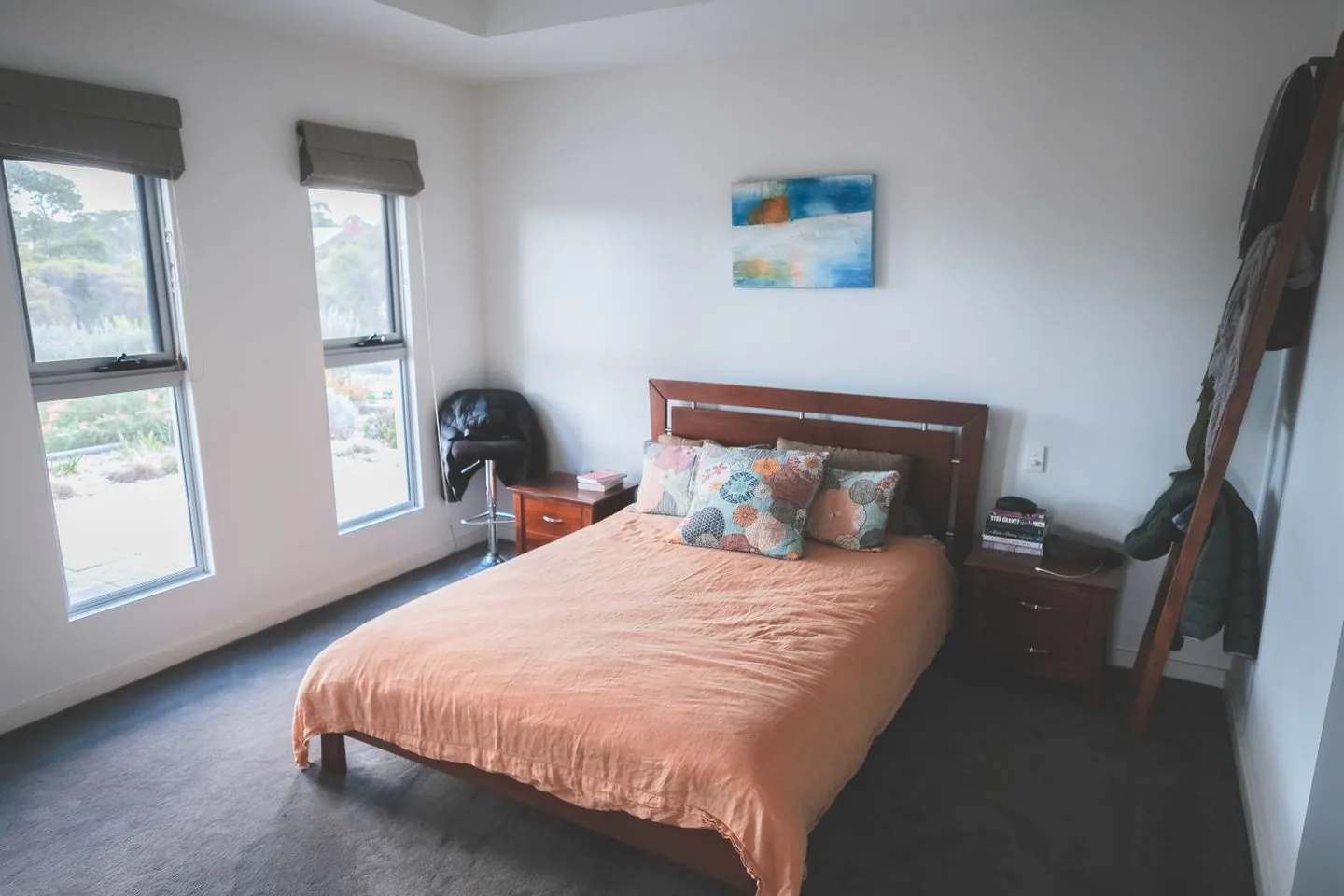
A cushion, throw, lampshade or artwork allows experimentation without a major alteration. Choose an item that has a useful or meaningful place in the room. Adding several small decorative objects purely for their colour can create clutter before the palette has improved.
Place the new element where it will actually be seen from the usual seat or doorway. A colour hidden in a far corner may feel like an afterthought. If it looks too isolated, repeat a related shade once elsewhere rather than buying an entire matching set immediately.
Vary the proportion and texture
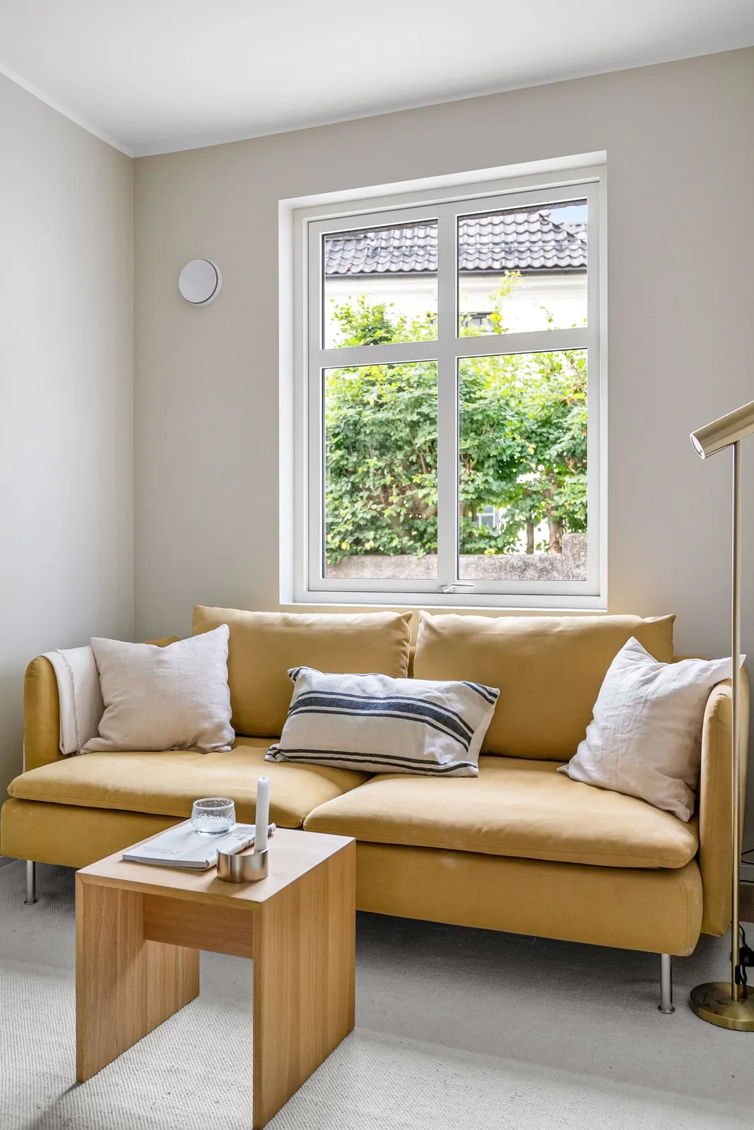
Colour feels more natural when its appearances are not identical in size and material. A substantial patterned cushion might relate to a small detail in a print, while a ceramic object introduces a slightly deeper version. The relationship can be loose enough that the room still feels collected.
Keep some neutral space around these elements. If every cushion and accessory changes at once, it becomes difficult to tell which choice is working. Add one layer, live with it and then decide whether another is necessary. Restraint makes the new colour easier to appreciate.
Consider a larger change only after testing
If the accent feels right, you might extend it to curtains, a chair or a wall. Larger areas affect the room differently, so use generous samples and review them under the actual lighting. A colour enjoyed in a small object can be overwhelming across an entire wall, or surprisingly gentle when used in a softer finish.
Account for nearby rooms too, particularly where doors remain open. Colours do not need to match throughout the home, but the views between spaces should feel comfortable to you. Test the transition from both directions before committing to a difficult-to-reverse change.
Stop before the colour becomes a theme
A few connected notes are usually enough to make a neutral room feel more personal. There is no need for every object to repeat the chosen shade. Existing books, plants and everyday possessions will contribute their own colours naturally.
Check the room after a week of normal use. If it feels more welcoming and still easy to live in, keep the arrangement. If the accent dominates, reduce one appearance rather than starting over. Introducing colour works best as an adjustment to a room you use, not as a requirement to replace everything around it.
Start with one colour relationship and expand only if the room needs it.
A Swishover guide · Practical ideas to adapt to your own home.
Spotted something we should improve?