Find the chair's place before its colour
A bright chair can look inviting in a photograph while occupying the only clear route through a real room. Mark out its likely footprint, including the space needed to sit down and get up. Check the width of the arms as well as the seat. A compact-looking curved chair may occupy more floor than its front view suggests.
Decide how it will be used. A reading seat needs comfortable support and suitable light; an occasional conversation chair may need to face the sofa without blocking a door. If no useful position exists, adding a chair purely for colour will probably make the room less pleasant. A textile or artwork can provide colour without taking that floor space.
Compare colour against the fixed elements
Look at the floor, walls and largest upholstery before choosing a fabric. These are the surroundings the chair must live with, not just the colours in a product photograph. Request a sample where possible and move it around the proposed position. Daylight from different directions and evening lamps can change the apparent warmth and strength of the colour.
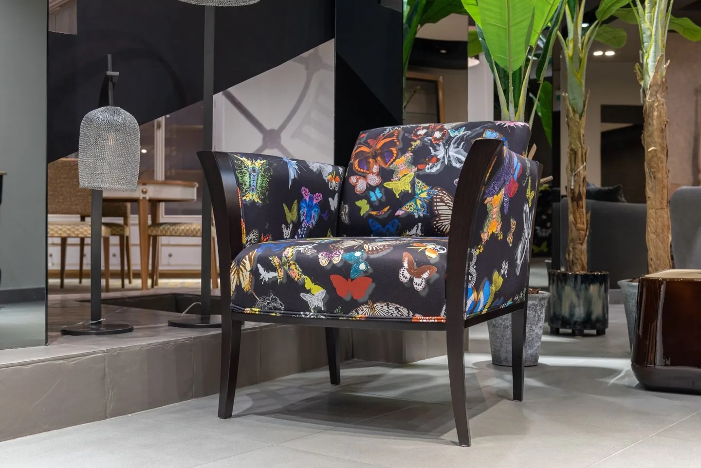
A muted green or rusty red may feel distinctive without being overwhelmingly bright. If you prefer a stronger shade, let that be intentional and keep nearby details relatively quiet. There is no need to repeat the exact colour everywhere. One small connection elsewhere, perhaps in a print or cushion, can be enough to make the choice feel at home.
Let the outline carry some interest
Colour is only part of the chair's presence. A solid block of upholstery makes a different impression from a light frame with visible legs. In a small room, the view under and around the chair can help the arrangement feel less crowded. In a large room, an extremely delicate chair may look disconnected from substantial neighbouring furniture.
Try the seat if you can. Check the height, depth, arm position and ease of getting up, rather than relying on a style description. The person using it most should be comfortable in their normal sitting position. A chair that requires a stack of extra cushions to feel usable may not be the right fit, regardless of its appealing fabric.
Give the chair a modest supporting cast
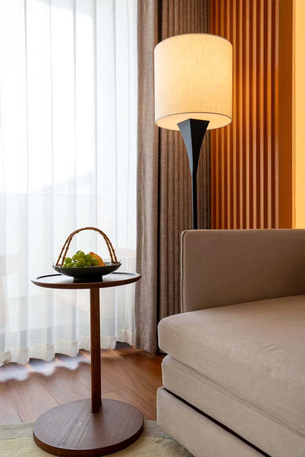
A small nearby surface can make the chair useful for a cup or book. Place it where reaching does not require twisting awkwardly, and keep the route around both pieces clear. A suitable lamp can complete a reading corner if the cable has a safe path to a socket. These functional additions are usually more valuable than extra decorative accessories.
Avoid surrounding the chair with several other strong colours immediately. Live with the main change first. It may already supply all the contrast the room needs. If you add a cushion, check that its size does not reduce the usable seat excessively and that the fabric feels comfortable against the chair's own upholstery.
Choose a finish you can maintain
Read upholstery care information before ordering and consider everyday spills, pets and sunlight. Removable covers are useful only if their cleaning instructions suit your routine. Check delivery access and return terms as well as the room measurements. A coloured chair should become a seat people naturally choose, with its visual appeal supporting that everyday comfort rather than replacing it.
Choose the chair for comfort and fit, then use its colour as a small, deliberate change of pace.
A Swishover guide · Practical ideas to adapt to your own home.
Spotted something we should improve?